- EGRAG CRYPTO outlined two long-term XRP scenarios using monthly charts and Fibonacci extensions.
- Chart 1 targets $11 if XRP holds a deeper floor near $0.60, but requires higher volatility.
- Chart 2 targets $8.64 with a higher floor near $0.90, offering less downside but a lower ceiling.
XRP is sitting at one of those “everything depends on the next few moves” moments, at least according to the long-term chart crowd.
Crypto analyst EGRAG CRYPTO (@egragcrypto) recently shared two monthly-chart scenarios for XRP, outlining what he sees as the major paths the asset could take from here. Both setups rely on long-term structure, Fibonacci extensions, and trendline support that has been respected for years. The difference is basically this: one path is messier but offers bigger upside, while the other is smoother but comes with a lower ceiling.
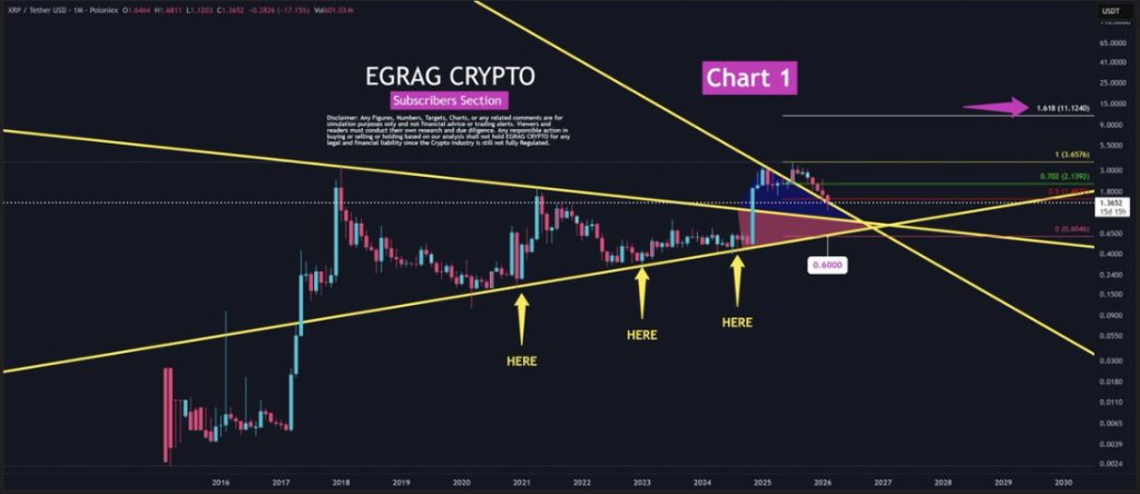
Chart 1: The Painful Route With Maximum Expansion
The first chart is the more aggressive scenario.
In this setup, XRP bottoms around $0.60 and eventually reaches a potential top near $11. The chart shows multiple historical support points along a long-term ascending trendline, suggesting these levels have repeatedly held up under selling pressure.
EGRAG describes this as the path that tests conviction. It implies a deeper drawdown, more volatility, and a market environment where investors have to sit through uncomfortable price action before anything really pays off. It’s the kind of scenario that feels awful while it’s happening… and then looks obvious later, if it plays out.
The Fibonacci extension on this chart places the 1.618 level around $11.12. That’s where the $11 target comes from. And if the $0.60 support holds, the upside is obviously massive relative to the downside.
This trendline has been tested multiple times going back to 2016. The most recent retest was in late 2024, which was followed by a sharp rally of around 500%. Each time price touches that lower boundary and survives, it strengthens the structural argument behind it.
So in this scenario, $0.60 is the “deep value” zone. Not comfortable, not pretty, but potentially powerful.
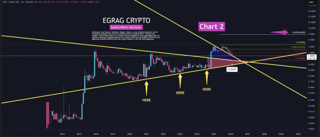
Chart 2: A Cleaner Path With a Lower Ceiling
The second chart is the more conservative version.
Here, XRP holds a higher floor around $0.90 and targets a top around $8.64. The structure implies less drawdown and less stress. It’s the kind of chart that feels more “normal,” where the market doesn’t need to fully collapse before it starts building upward again.
The 1.618 Fibonacci extension in this scenario sits at $8.64, which is still a very meaningful upside target — just not as explosive as the $11 path.
This chart also shows the same ascending trendline providing support at several historical points. But instead of a sharp rebound from a deep low, Chart 2 shows more price compression and steadier accumulation before the move upward.
EGRAG points out that this scenario is more comfortable for investors. It reduces downside risk, but it also means the trade becomes more crowded. More people will be willing to buy a “safer” floor, and that can limit upside expansion compared to the more painful, capitulation-style setups.
In short, Chart 2 is the stability route. You get less fear, less drawdown, but also less reward.
Two Roads, Same Structure
What’s interesting is that both scenarios are built on the same long-term foundation: XRP respecting a rising trendline that has been in play since 2016. The difference is simply where XRP finds its floor and how much volatility the market has to endure before the next major leg higher.
Chart 1 says: deeper dip, bigger breakout.
Chart 2 says: higher support, steadier climb, smaller ceiling.
Neither is guaranteed. But together, they frame the long-term XRP setup in a way that’s easy to understand. XRP is either going to flush harder before it flies, or it’s going to grind upward more calmly.
And as usual in crypto, the market will probably choose the path that feels most annoying in the moment